During these dramatic weeks of COVID-19 pandemic, my thoughts go to all people and families that are suffering because of the disease. Also, I think we should really thank all healthcare professionals that are currently fighting against the virus.
These visualizations are built on the top of the daily COVID-19 data obtained from John Hopkins University, and plotted using the Covid19CountsPlot R library (https://github.com/dami82/Covid19CasesPlot). Briefly, instead of visualizing cumulative data, here I am showing day-by-day numbers. The goal is trying to understand when selected countries (or US States) of interest are reaching an apex or a plateau. Also, I hope to gain insights about time relationships/gaps between number of new cases and COVID-19 related deaths.
Info and resources are available at the following URLs:
- JHU website: https://systems.jhu.edu/research/public-health/ncov/
- GitHub library: https://github.com/dami82/Covid19CasesPlot
- Daily Charts: https://www.data-pulse.com/dev_site/COVID19/
Today’s EU and US Charts

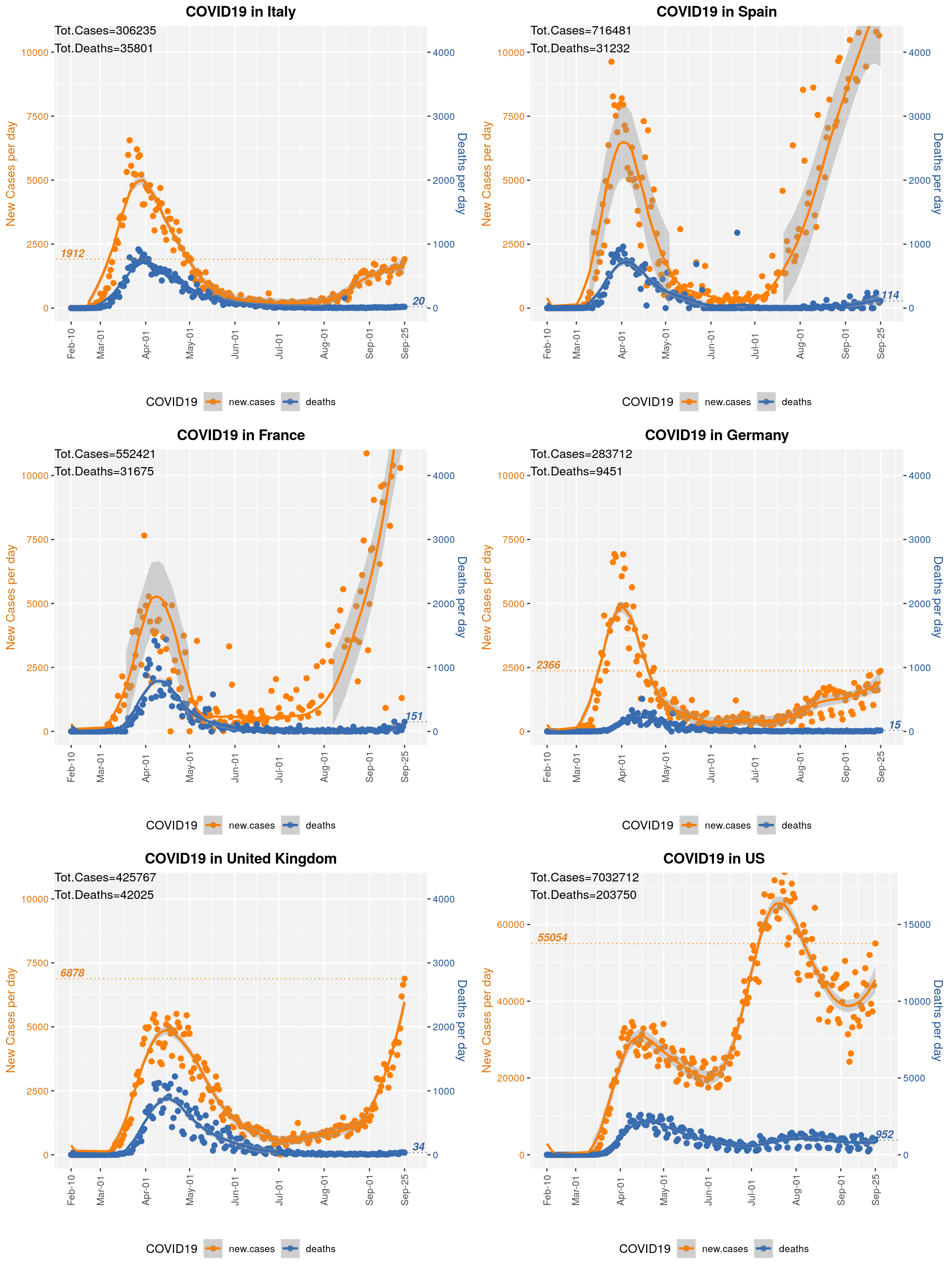
Figure 1. xy-plots showing the number of new daily COVID-19 cases (orange points, left y-axis) and number of daily deaths due to COVID-19 (blue points, right y-axis) with respect to time in a set of Countries of interest. The latest daily number of new cases and the latest daily death toll are reported. Trendlines were computed by LOESS. Data provided by John Hopkins University. Note: U.S. plot y-axis on a different scale.
Today’s Scandinavian Charts
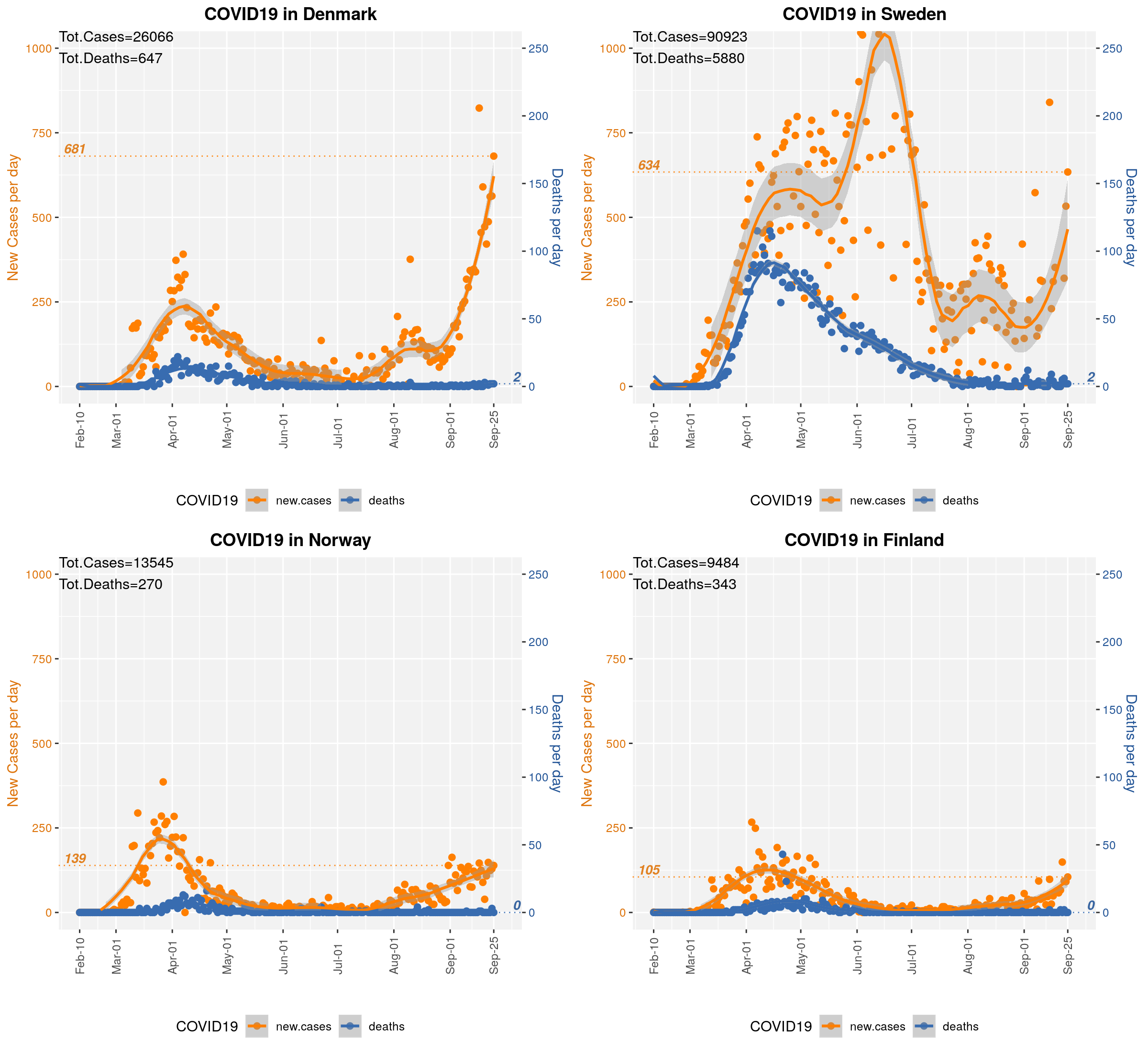
- Denmark: 5.8M people, density=137/km2; largest city: Copenhagen, population=794K
- Sweden: 10M people, density=23/km2; largest city: Stockholm, population=970K
- Finland: 5.5M people, density=16/km2; largest city: Helsinki, population=650K
- Norway: 5.4M people, density=14/km2; largest city: Oslo, population=693K

Figure 2. xy-plots showing the number of new daily COVID-19 cases (orange points, left y-axis) and number of daily deaths due to COVID-19 (blue points, right y-axis) with respect to time in 4 Scandinavian Countries. The latest daily number of new cases and the latest daily death toll are reported. Trendlines were computed by LOESS. COVID-19 data provided by John Hopkins University. Country data from Wikipedia. Note: Sweden did NOT enforce a lock-down during the COVID-19 emergency.
Today’s US States Charts
Top-20 US States by cumulative number of confirmed cases.

Figure 3. xy-plots showing the number of new daily COVID-19 cases (orange points, left y-axis) and number of daily deaths due to COVID-19 (blue points, right y-axis) with respect to time in a set of US-states of interest. The latest daily number of new cases and the latest daily death toll are reported. Trendlines were computed by LOESS. Data provided by John Hopkins University. Note: Plot have y-axes on independent scales.
Today’s US County Charts
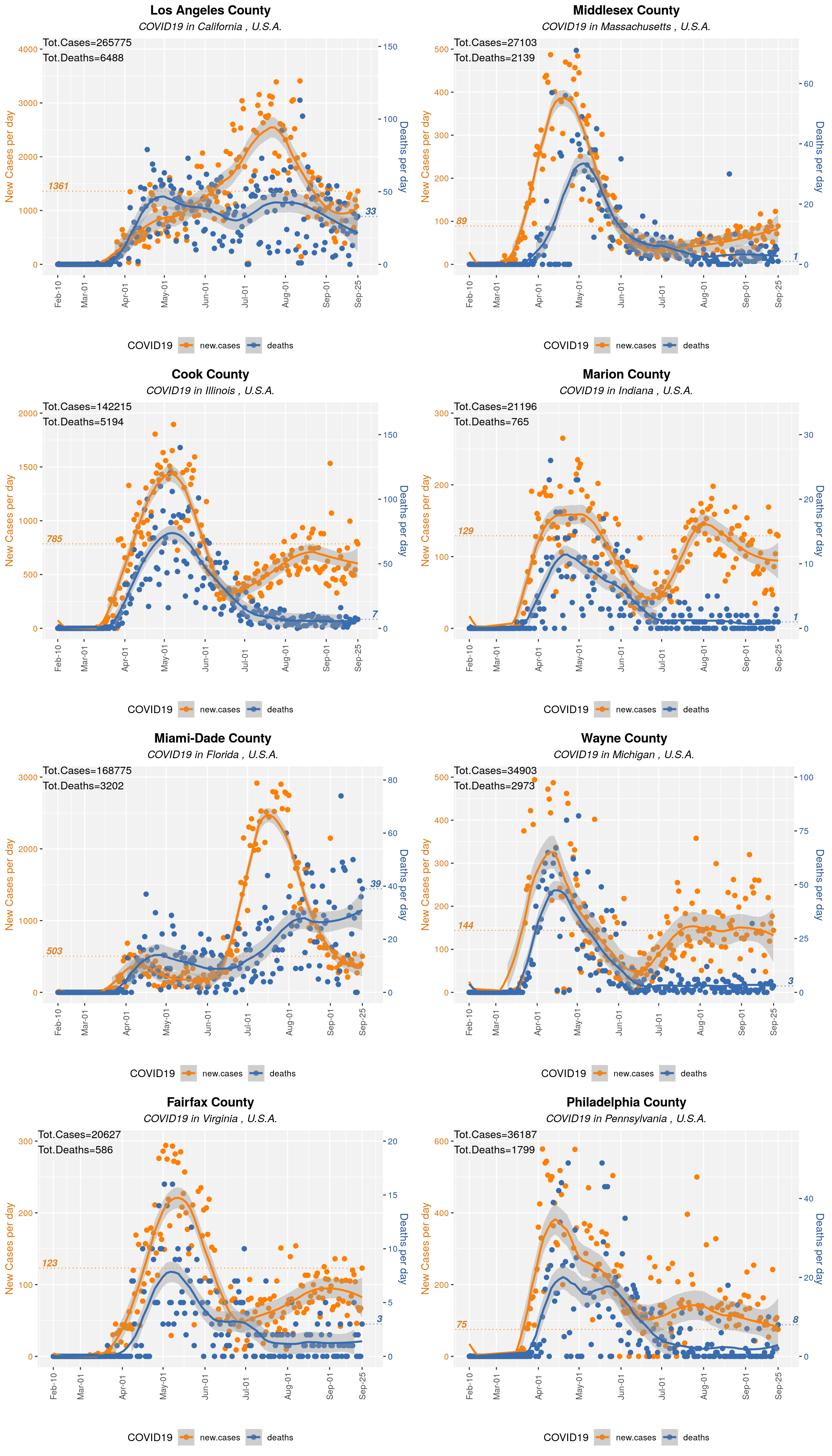
Selected US Counties: Los Angeles, Orange (CA), Cook (IN), Marion (IN), Miami-Dade (FL), Wayne (MI), Fairfax (VA), and Philadelphia (PA).

Figure 4. xy-plots showing the number of new daily COVID-19 cases (orange points, left y-axis) and number of daily deaths due to COVID-19 (blue points, right y-axis) with respect to time in a set of US-counties of interest. The latest daily number of new cases and the latest daily death toll are reported. Trendlines were computed by LOESS. Data provided by John Hopkins University. Note: Plot have y-axes on independent scales.
Archive
- July 1st, 2020
- June 29th, 2020
- June 28th, 2020
- June 25th, 2020
- June 24th, 2020
- June 23rd, 2020
- June 22nd, 2020
- June 18th, 2020
- June 15th, 2020
- June 14th, 2020
- June 9th, 2020
- June 5th, 2020
- June 3rd, 2020
- June 2nd, 2020
- May 31st, 2020
- May 26th, 2020
- May 25th, 2020
- May 24th, 2020
- May 23rd, 2020
- May 22nd, 2020
- May 21st, 2020
- May 20th, 2020
- May 19th, 2020
- May 18th, 2020
- May 17th, 2020
- May 16th, 2020
- May 15th, 2020
- May 13th, 2020
- May 12th, 2020
- May 11th, 2020
- May 10th, 2020
- May 9th, 2020
- May 8th, 2020
- May 6th, 2020
- May 5th, 2020
- May 4th, 2020
- May 3rd, 2020
- May 2nd, 2020
- May 1st, 2020
- Apr 30th, 2020
- Apr 29th, 2020
- Apr 27th, 2020
- Apr 26th, 2020
- Apr 25th, 2020
- Apr 23rd, 2020
- Apr 22nd, 2020
- Apr 21st, 2020
- Apr 20th, 2020
- Apr 19th, 2020
- Apr 18th, 2020
- Apr 17th, 2020
- Apr 16th, 2020
- Apr 15th, 2020
- Apr 14th, 2020
- Apr 13th, 2020
- Apr 12th, 2020